Sunday, November 28, 2010

Could There Money in Walking Eyeballs?

I’ve been a doodler my whole life. My notes from classes & business meetings, phone messages & grocery lists are usually adorned by horsies with windblown mane, smiling suns with complicated rays, ornately framed words and eyeballs with feet (sometimes smoking a cigarette like a French eyeball á la Rick Griffin). Sometimes I sketch people or objects in the room, draw imaginary flower arrangements, or draw portraits of my friends Archie style.

Chief Doodler Michael Lopez demos.
Lea Suzuki / The Chronicle
It’s been interesting to see doodles, which have long seemed to be an unnoticed solitary activity, start to appear in the news. I’ve been talking a lot with Denis Kitchen about his soon-to-be released book of his own doodles, Denis Kitchen’s Chipboard Sketchbook, with all of his surreal characters and wacky animals. Cartoonist Lynda Barry recently told NPR about how doodling helps her through writer’s block (personally I get carried away and keep drawing). Now, on the front page of the print edition of the Sunday SF Chronicle, we have a feature article on “the doodlers of Google” who draw all those cartoons on the Google home page.  It’s an interesting story about how the idea of these doodles came about, and how the doodles help Google seem more personal and connected to the millions of people who use the site. Chief Doodler for Google! A real job! Maybe there’s hope for making real money in the arts yet…

Still, more than the mythical high paying art job, is the fascination with doodles themselves. Why do we do it? Why do so many people find it relaxing to draw funny animals? Most people will tell you that it’s a subconscious, unplanned process. They put pencil/pen to paper, start a line and discover the drawing as it happens. I think we, the viewers, are intrigued by the mental process these drawings reveal, or maybe we just enjoy the looseness and spontaneity of them, a peek into the artist’s unguarded mind. I guess no matter how focused we get on staring at glowing screens, we still have an urgent need to express ourselves with our hands by creating something.

Wednesday, November 24, 2010

Mark Bodé, Part 3 on Comics Journal Blog

Left: Christophe Blanc, Je suis la fin ces haricots, serigraph, 62 x 40 cm, ©2009 Christophe Blanc.Right: Poster for Mark’s next show, Monterey Pop Art in January, 2011.
Third and final installment of my interview with Mark Bodé on the Comics Journal blog.

Monday, November 22, 2010

Mark Bode, Part 2 on Comics Journal Blog

Cobalt 60 ©1984 Barbara and Mark Bodé.
Part two of my interview with Mark Bodé has been posted on the Comics Journal blog.

Mark Bode Interview on CJ Blog

Mark Bodé in North Beach.
The first part of my interview with comics/mural/tattoo artist Mark Bodé starts today on the Comics Journal blog.

Saturday, November 13, 2010

Kitchen Q & A at MoCCA


Photos of the Oddly Compelling Mini-Retrospective and Denis speaking to an attentive crowd at MoCCA in New York, 10/21/10. The show is up from October 5th through January 30th, 2011. All photos by Gary Dunaier.

Friday, November 5, 2010

Al Capp & Charles Schulz: Clash of the Titans

Capp Self-Portrait, mid 1940's
 In October of 1968, the American cartoonist Alfred G. Caplin, better known as Al Capp (1909-1979), brutally parodied Charles Schulz's (1922–2000) Peanuts over 3 consecutive Sundays in his own Li'l Abner strip.  Capp, perhaps the best-known satirist of his era, loved to parody fellow cartoonists. Milton Caniff enjoyed it when he and his characters were roasted, as did Allan Saunders (Mary Worth). But Ham Fisher (Joe Palooka) was an uncomfortable target. It was inevitable that Peanuts was subject to Capp’s lampooning. Denis Kitchen & I, while researching another project, started thinking about the interactions between these two superstar cartoonists, who were total opposites in style and personality.  
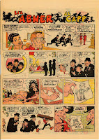
 Al Capp, the older of the two, was the traditionalist. Li’l Abner, the title he was best known for, debuted in 1934. His influences were the American comic strip cartoonists Tad Dorgan, Cliff Sterrett, Rube Goldberg, Rudolph Dirks, Fred Opper, Billy DeBeck, George McManus and Milt Gross and the Punch cartoonist–illustrator Phil May.  He was also well read, and devoured most of the literary classics while still a teenager.  Once Abner was established, he kept a traditional shop, with many assistants working on the strip.  At its height, Abner was a masterpiece of cultural and political satire.  Capp was a larger than life personality that enjoyed fame and seemed to have a psychological need to stay in the public eye.

At the end of the 1940’s and into the 50’s, Capp was at the height of his popularity. In 1947, he was awarded the Ruben by the National Cartoonist Society, the subject of a long 2-issue profile in The New Yorker and featured on the cover of Newsweek. In 1948 the Shmoo craze erupted, with the orgy of merchandising that followed. In 1950, he was also cover profiled in Time. In 1952, the wedding of Li’l Abner and Daisy Mae made national news, including the cover of Life Magazine.

Building in momentum around this time, several social and cultural events happened that seemed to knock him off course:
  • After the WWII era, there were physical changes in the format of comic strips themselves, forcing Capp to reduce the number of panels in his stories, and the amount of cross-hatching and detail customarily shown within the panels.
     
  • There was the movement away from figurative work in the arts. Contrast the WPA social realist style of illustration, which would have been happening around the time Capp was beginning his career, with the Modernist movement of the Abstract Expressionists, such as the color-field paintings of Mark Rothko, or the minimalist paintings of Ellsworth Kelly and Frank Stella.

    In the Li’l Abner strip Kissin’ Cousins, which ran on June 30, 1957, Capp spoofed modern art by having his character Tiny Yokum win a French art competition with a blank canvas. Tiny’s “prize-winner” references conceptual paintings like Kasimir Malevich’s White on White (1915) which hangs in the Museum of Modern Art (his related Black Square on White sold in 2000 for $1 million). American artist Robert Rauschenberg created his White Painting in 1951, comprising seven monochromatic white panels. Capp regarded such notorious works of “art” as intellectual fraud. His oft-quoted observation of abstract art was that it was "the product of the untalented, sold by the unprincipled to the utterly bewildered.”
     
  • There was the generational change from the post-war and Eisenhower era into the social turmoil of the 1960’s.  Capp was able to satirize political monsters like McCarthy, yet found the attitude of the 60’s generation unfathomable, even treasonous.
It is our feeling that Charles Schulz (1922-2000), whose Peanuts strip was first syndicated in 1950 (and had a meteoric rise thereafter), may have indirectly become a living symbol of some of these changes for Capp. It was Schulz’s perception, mentioned in several interviews, that Capp was jealous of Schulz’s success, replacing him as the top cartoonist, and the bitter tone of Capp’s 1968 Peanuts parody seems to bear this out.

Schulz personally drew the Peanuts strip himself, and liked the routine of it. He was an introspective man, who enjoyed approval, but was uncomfortable with being famous. Although he struggled with it in the beginning, Schulz settled into a very spare, modern, minimalist style of drawing. The interest in the collective unconscious, pop psychology, and the self-help fad (“stop smoking through self-hypnosis,” etc) that bloomed in 1950’s manifested in the militant self-empowerment of the 60’s, and the self-aware children of Peanuts were ideally suited to the era.

Schulz was introduced to Al Capp sometime in the early 1950’s, in conjunction with the National Cartoonist Society (possibly by Mort Walker, who was president at that time). Schulz won the Ruben himself not long after, in 1955.  It seems that in this period, a critical dialog developed between Schulz and Capp, arguably the two most visible American cartoonists. Schulz, for example criticized the marriage of the Abner characters as "the worst mistake Al Capp made" because it altered the fundamental dynamic of the strip. In 1965, Capp opined that the Peanuts characters were "good, mean little bastards. Eager to hurt each other."

In the 60’s, Capp’s star was fading, and he took a few swipes at his “successor.” In his 1968 parody, he pointedly made fun of the psychological elements of Peanuts, even going so far as to suggest that Schulz was one of those modern artists that didn’t know how to draw (“my kid could do that,” he implies through Abner’s sketch). “Well, it’s just about run its course, you know," Capp said at the time, "Little kids talking like adults. It’s just about run its course.”  It seems ironic that Capp began his attack with comments about licensing and corporate sponsorship, considering the prodigious amount of merchandising and endorsements Capp had himself (although that time had largely passed for Li’l Abner by the late ‘60s). Apparently the two artists had a falling out over these strips, but by 1995, in an interview with Gary Groth, Schulz characterized it as "an unfortunate misunderstanding."

In 1974 Capp attempted to cash in on the pop art craze by selling limited edition serigraph prints, apparently figuring that if people would pay Warhol and Lichtenstein millions for “rip-offs” of comics characters, they would jump at the chance to buy the “real thing,” ignoring the theoretical underpinnings of this kind of work. The general public snapped them up, but he did not win the critical acclaim he was reaching for. At this point, Peanuts has become a worldwide phenomenon, and Capp, beset by personal scandal, is spiraling toward the end of his life and career.

Summary

Al Capp and Charles Schulz, who dominated the world of comic strips in their respective overlapping eras, are a study in remarkable contrasts. Each experienced a quick meteoric rise to fame from humble beginnings, Capp during the Great Depression and Schulz in the postwar boom, but their cartooning styles are virtual mirror opposites: Capp’s brushwork is dark, spotted heavily with black ink and cross-hatched. Even his lettering is bold. Schulz’s pen lines are light and spare but heavy with expression. Capp, a social creature, worked on his strip with several assistants; Schulz labored solo. Capp’s Dogpatch, almost devoid of children, was populated with scheming and power-hungry men, and with women who were either grotesque or voluptuous. Schulz’s asexual cartoon universe was virtually devoid of adults, yet its characters were often wise and world weary. Capp was a brash, outspoken East Coast Jew who craved the limelight and success, while Schulz was an introspective Midwesterner not especially comfortable with the limelight. Commercial success and television and Broadway adaptations aside, what they had in common was that each, in his own distinct way, captured the imagination and loyalty of tens of millions of readers daily while providing insights —both profound and funny— into the human condition.

Kim Munson & Denis Kitchen. Images © Capp Enterprises, Inc.

Thursday, October 21, 2010

October SF Gallery Walk

Went to the annual Yerba Buena gallery walk on October 16th, and I was really disappointed, not by the art on view, although I didn’t see as much as I would have liked, but by the fact that the galleries were basically empty. It looked to me like the gallery walk drew a pretty sizable crowd of art lovers in the past, but this year, I was often the only one looking.  Also, a few of the galleries I always look forward to checking out, such as SculptureSite on 3rd Street, have disappeared.  The economy must be really tough on independent galleries.

I started at the Cartoon Art Museum and saw the excellent show Graphic Details: Confessional Comics by Jewish Women co-curated by Michael Kaminer and Sarah Lightman, loosely based on an article about confessional comics written by Kaminer for The Forward (a weekly Jewish newpaper).  The drawing styles & storytelling vary widely from underground comix pages of the 60’s to more contemporary work in watercolor. It was like having a glass of wine with interesting and opinionated friends.  See the impressive list of artists represented on the CAM site here.

A few blocks away at Crown Point Press, I enjoyed the current Significant Others show, but found myself mesmerized, as usual, by the prints by Wayne Thiebaud in the hallway (Dark Cupcakes and Donuts, 2006 on the left).  Even In tones of grey, his compositions vibrate off the paper. He continues to amaze me. I hope I can make it to see his retrospective at the newly re-opened Crocker Museum in Sacramento before it ends. Catherine Clark Gallery had an astonishing show of the recent work of Masami Teraoka, both his politically charged and erotic ukiyo-e style paintings and his The Last Supper/Pope's Mega Squid Thrust, a very graphic commentary on the weird sexual politics of the Catholic church, done in the style of a gothic altarpiece.

Monday, September 27, 2010

24 Hour Comic Challenge 2010

This coming Saturday 10/2, the Comics Outpost (SF) and Comic Relief (Berkeley)  We will be hosting the 24 Hour Comic Challenge! Beginning at 11am artists will have 24 hours to create a 24-page comic.

The Outpost will be open the entire time (11am Saturday to 5pm on Sunday 10/3), with an "Insane After Midnight Sale" thrown in to entice visitors to drop in.  They've hosted this event for a couple years now, and always get an interesting crowd. Last year Gary Buechler shot a 15 minute documentary commemorating the experience.

The Comics Outpost is in the Outer Sunset district at 2381 Ocean Avenue,  San Francisco, CA. 94127. (415) 239-COMX (2669).

Monday, September 20, 2010

Kitchen Mini Retrospective at MoCCA

The Oddly Compelling Mini-Retrospective of Denis Kitchen will open at MoCCA (NYC) October 5th and run through January. It will consist of approximately twenty hand-selected pieces that will attempt to summarize Kitchen's cartooning career. The focus will be on pieces that appear in the recent Dark Horse book The Oddly Compelling Art of Denis Kitchen,such as “Working in Geektown,” the Bizarre Sex #1 cover, Major Arcana album cover, “The Square Publisher,” and “Five Minutes with God.” Opening reception 10/1 at Noon, Details on a Q & A session are still to be announced. Denis has worn lots of hats in his career; publisher, founder of the CBLDF, agent, writer, curator, collector and artist. I hope that this is the end of "artist" lagging behind at the end of this list, and that there will be more substantial "Art of Kitchen" shows yet to come.

Even at times when the demands of business take over, creativity will still find a way to leak out. In the case of Denis Kitchen's Chipboard Sketchbook (to be published by BOOM! Studios in October), it took the form of funny and surreal doodles on the chipboard backing of notepads, drawn in Sharpie and fine-point Uni-Ball pens (example on the left).  As a film industry & dot-com vet, I've sat through my share of brain sucking meetings, and I can't help trying to visualize what was going on when Kitchen drew some of these. Among the many wacky animals, winged and fish-headed humans, and all the other stuff, some things jump out. There's a whole drawing centered around $56.00 (the price of a book? dinner? who knows?).  Numerous drawings with knives and sarcastic comments lead me to think that the meetings weren't always pleasant. Other drawings are just fun and wacky; as Denis explains his "demented" drawings are a "stream-of-consciousness" expression, totally spontaneous and unplanned.  I'm looking forward to seeing an exhibition of these too, although I admit, now that I've seen them, I'm going to wonder what he's drawing every time we're on a long conference call :-)

Recent articles: Publisher's Weekly | ITCH interview| Facebook Event Page


Richard Guy Wilson at the Disney Family Museum

When my friend, author and art historian Hannah Sigur, invited me to a lecture by the architecture and design expert Richard Guy Wilson, sponsored by the Institute of Classical Architecture & Classical America, I wasn’t sure what to expect.  Part of the attraction was that it was being held at the theatre at the new-ish Walt Disney Family Museum in the Presidio, and I still haven’t made it over there. I’m a big animation fan, and it’s been on my to-do list for a long time, but the bay area is rich in fabulous museums. It’s almost a full-time job to keep up… I digress.

The event started with a reception in the lower lobby (as this was an evening event, the rest of the museum was not open to view).  Aside from the good conversation, the other high point of the reception was that the lower lobby seemed to be a tribute to Disney concept artist Mary Blair. The room was ringed with many posters by her, and the pattern set in the floor is based on one of her concept paintings for It’s a Small World.  In a case near the center of the room, I was pleased to see a large paint stand (sort of a combination storage chest and worktable), with some of her tools and art supplies and a pair of her eyeglasses.  Let’s face it, as an artist myself, I’m a sucker for art supplies. I can stare at tubes of paint and visualize how they could be used for hours. In this case, the tubes that were shown seemed to be a good representation of her bright and whimsical color palette.  The display also included some photos of Blair, and a hard hat decorated with day-glo flowers bestowed on her by her colleagues at Disney Imagineering. I tried to snap a photo, but was denied. However, I found this one on the Disney Family Museum web site with an article about the installation of the exhibit.

The Disney Museum theatre itself was interesting. It’s painted with comets, constellations and other space related graphics. For this event the house lights stayed up, but I imagine that the stars and comets probably glow in the dark.  In this setting, we settled in to listen to Wilson talk about “The American Renaissance” period, roughly from the 1870’s through the 1930’s. Wilson is the Commonwealth Professor’s Chair of Architectural History at the University of Virginia (Thomas Jefferson’s University), in Charlottesville, Virginia. He is a former Guggenheim Fellow and Visiting Fellow at Cambridge, and his specialty is the architecture, design and art of the 18th – 20th century.


The American Renaissance, Wilson explained, an era in which the United States, trying to prove its maturity as a country, worked to establish its own identity. It was at this point that Americans made an effort to mythologize the country’s history, accumulated the foundations of many art museum’s collections, and began to incorporate the classical elements of Greek and Roman architecture into city plans and civic architecture. Wilson tied the result of this progression into several examples here in the bay area, notably the San Francisco City Hall (left) and civic center, and the Palace of Fine Arts, which remains from the 1915 Panama-Pacific Exhibition.


Wilson is an excellent speaker with a sense of humor, and he held our attention throughout. I’d read quite a bit about city planning and architecture in this period, but he was able to sum it up and populate the story with the personalities of the architects, designers and moguls that drove this transformation in American history. 

Monday, August 23, 2010

Trends in Floral Design


The slides above are cell snaps from a floral design demo by Kevin Ylvisaker AIFD, PFCI sponsored by the local unit of Teleflora hosted by Brannan Street Floral Wholesale at the SF Flower Mart.

Kevin created all the arrangements in these photos. In the captions, I discuss points that he brought up as he created the arrangements, but overall his main points were:

Martha style arrangements are dead. Many people still like them, but that's not where contemporary design is going. Monotone and grouped designs are popular. Design is more spare and architectural, and not so much about round mounds of mixed flowers.

Turquoise will be the happening color of the year. Bright colors like lime green, orange, hot pink and bright purple are still trendy. Chocolate is out, and has been replaced by a warm gray/black Charcoal.

More flowers, less greenery. Use moss to cover foam if needed. Even garden style arrangements are more structured.

We love glass cubes. We fill them with colored foam, colored foam shapes, dyed beads, colored wire, curly willow and grasses.

Glitter and dyed flowers are popular. Especially flowers dyed blue.

There was lots more information, and I was fascinated with how quickly and deftly Kevin could create design after design, while talking and joking the whole time.  I would think these same trends are probably appearing in most creative endeavors.

Sunday, August 1, 2010

Griscom in Fraction Magazine

Beale Street, Tom Griscom
 Tom Griscom's Bay Area Labor Project photos are featured in this month's issue of Fraction Magazine. Even though we worked on this project together in 2008, I'm still surprised by the depth and beauty of these photos everytime I see them. Please check it out.

Thursday, July 29, 2010

Are all the “Action Chicks” in the music business?

Since getting home from San Diego, I’ve been ruminating on an interesting but ultimately unsatisfying Comic Arts Conference panel I attended called “Where are all the Action Chicks”? Meaning, “Where are all the strong female lead characters in TV, Film and Comics”?

Kramer, Stuller & Misiroglu
The panel seemed promising (and had a huge line for a CAC panel). The moderator Katrina Hill (ActionFlickChick.com, see summary here) was joined writer/scholars Jen Stuller (Ink Stained Amazons) and Gina Misiroglu (Encyclopedia of Women in Popular Culture) who both did a heroic job of summing up the history of female heroes in Film, TV & Comics in ten minutes each. Comics writer Marjorie Liu (Black Widow) and the always insightful J. Michael Stracznski (Thor, Wonder Woman, etc…) were there and had interesting things to say but left early. Rounding out the panel was a bevy of media chicks & actresses including Jill Pantozzi (MTV Splash Page), Adrianne Curry (America’s Top Model, who was dressed in a Princess Leia Slave costume), Cindy Morgan (TRON), and Clare Kramer (Buffy).  Morgan told an interesting story about an on-line campaign to pressure the producers at Disney to include her in the new Tron: Legacy film, but otherwise, this panel seemed to kept circling around the usual litany of complaints with no real substance or suggested solutions.  I didn't disagree with most of what was said, but with all the brains in the room, I hoped for more. The fact that Angelina Jolie, arguably the chief female butt kicker in film these days, was just there the day before promoting Salt went without comment.  I think the public actually enjoys seeing a strong female heroine, but it has to be the right female heroine.  We need to figure out how to keep building on our successes. It will be interesting to see how Scarlett Johansson’s Black Widow is handled in the upcoming Avengers film.

2010 The New York Times Co.
One of the panel participants asked “where are the women who could really kick some ass?”  I’ll tell you… have you seen Christina Aguilera lately? An article in Sunday’s New York Times (Pure Gaga: Spectacle Rules by John Caramanica) got me thinking about this.  Here are all these ladies in pop music: they are rich, famous, have athletic bods, wear crazy revealing costumes, and they can dominate an audience (Photo: Lady Gaga, foreground left, and Beyoncé, right, in the "Telephone" video). The point of the article was a compare/contrast between the sincere, singer-songwriter Lilith Fair style performers (not doing well) and the outrageous spectacle of the Lady Gaga generation bad girls.  Maybe the general public wants distraction from their problems instead of introspective confessions?  I don’t know, but if you are looking for women in spandex that look like they could kick some ass, here they are.

JMS & "WW 601 Players"
One comic heroine that is still kicking ass is Wonder Woman, who just got a controversial reboot by DC and J. Michael Stracznski. Although I understand some people’s concerns about the change to her iconic outfit, personally I’m glad to see her wearing clothes that she can actually fight in without her breasts or butt falling out.  It’s funny in a way that Wonder Woman is finally getting to cover up and Lady Gaga and Beyoncé in the photo above are obviously referencing her and not wearing much, but I digress…. I bring this up because I witnessed what must have been a ComiCon first at the JMS spotlight session, a staged reading of a comic book.  Bummed out that Wonder Woman #601 wouldn’t be out in time for SDCC, he brought in 4 voice actors (the "Wonder Woman 601 Players") and had them do a dramatic reading of the characters, while he narrated and the drawn pages were shown on the big screen.  Overall, I like this change. JMS is strong in character development, and I loved his reboot of Thor and his mythological world. I’m not sure how this version of the character will fit within the DC Universe (or if DC will completely screw it up when the next big crossover event comes along), but I’m willing to give WW & JMS a chance (here's another review I agree with).

Ronald Searle, Ray Bradbury at 90


This Channel 4 News clip interviews British artist Ronald Searle an the occasion of the opening of a tribute exhibition at the Cartoon Art Museum (London) as he turns 90 (!) Coverage includes an extensive feature article in this month's ArtNews by William Feaver (not on-line at this time).

Weller & Bradbury
Also turning 90 is Ray Bradbury (pictured here with his biographer Sam Weller), the author responsible for my interest in reading science fiction.  At the San Diego ComiCon, where he has been a guest every year since the convention started 41 years ago, the standing room only crowd gave him multiple standing ovations, and sang "happy birthday" to him before leaving.

During Q & A time, people often get sort of teary and thank him for being such an inspiration. A couple years ago, someone asked "how does it feel to know that you've inspired all these young writers." With a expansive wave to the audience he said, "You are all my bastard children, and I love you."  We love you too Ray.

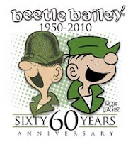
60 Years of Beetle Bailey: A Tribute to Mort Walker

This show, which is on display at the Cartoon Art Museum (San Francisco) through September 19, is exactly as the title states; a celebration of the Beetle Bailey comic strip, which was first published on September 4, 1950, and of the career of its creator, the prolific and hard working cartoonist Mort Walker.  Brian Walker, cartoonist, comics historian, and Mort’s son, curated the show. I was curious about this show, as the SF Chronicle dropped the strip a few years ago when they reformatted the comics page and it had been a while since I've seen it.

Mort Walker is one of those lucky people who learned what their passion and talents were at an early age and never stopped.  According to his bio, he published his first cartoon when he was 11 years old.  In his teens he contributed to newspapers and magazines, and worked for Hallmark Cards. In 1943, he was drafted into the army. Four years later, he was discharged as a first lieutenant. He graduated from University of Missouri in 1948, and then worked for Dell Publishing in New York.  He got his big break when King Features accepted Beetle Bailey for syndication in 1950.

There are 3 things I enjoy seeing in a show like this: the evolution of the cast of characters, the growth and change in the artist’s drawing style, and how cultural influences effect the strip.  This show did a good job presenting all three, and also provided some insight into the process of a working cartoonist and his studio.

The show begins with a couple of cartoons from a 1937 strip called The Limejuicers (sailors were called this because of the British navy’s practice of giving them a weekly allotment of citrus juice to help avoid scurvy), featuring Captain Salty Sullivan.  Mort, who was born in 1923, would have been 14 at the time.  These drawings have a very traditional style of illustration, with detailed backgrounds and fleshy, well-defined characters.  By the time the Beetle Bailey strip finds its mature look around the 1960’s, the backgrounds are spare and stylized.

Like the backgrounds, the style of the characters also evolves. In the beginning, Beetle Bailey is a college capers strip, based on Walker’s own memories of his college days. Early versions of the main character, Spider, show a thin, lazy guy with a hat over his eyes. Spider is renamed Beetle, and takes his last name from John Bailey, an editor at the Saturday Evening Post, who first encouraged Walker to create the strip.  After Beetle enlists in the Army in 1951, the character we are most familiar with emerges. Although the depiction of the Beetle character grows more stylized as time goes on, it is the character of Sargent Snorkel that really got my interest.  In the 1950’s, his body is triangular, with a long face, a big nose, and a serious underbite with two protruding bottom teeth.  He seems unbalanced. By 1960, the character has become the solid, round, grouch we know.
Bailey Exhibition at CAM,
photo by Andrew Farago.
The show includes social/cultural issues in several ways.  The strip ebbs and flows in its popularity with publishers in response to its stand on social issues (like bringing in Lt. Flap, a black character, in 1970) or in response the strip’s perceived disrespect of authority during and after wartime.  Three rejected strips from the 1990’s position General Halftrack’s obsession with Miss Buxley as a case of sexual harassment on the job.  Walker seems to sum up his “philosophy in the comics” in a 1970’s cartoon featuring the character Plato, who writes “Al Capp once said ‘you can’t draw a picture of a dog without making a statement on the condition of dogs.’ All cartoons therefore contain observations on mankind and society. Some cartoons are just more obvious in this regard.”

Over 60 years of daily strips, Walker’s observations on the conditions of daily life in the imaginary world of Camp Swampy have entertained generations of readers.  The show wraps up with descriptions of work at Walker’s studio, and representations of the trappings of fame: a photo with Nixon at a charity event, a mailer for fans, an animation cel from the 1990’s. On the whole, an interesting and new view of a comic strip that has become an institution.

Tuesday, July 27, 2010

Scott Greene: Trouble in Paradise


I was happy to stumble upon Scott Greene’s solo show Capitulare de Vita at the Catherine Clark Gallery (in SF, through August 21), as I had seen his fascinating painting Ship Shape at the Albuquerque Art Museum when I was there in February. I had no idea then that Greene, a graduate of CCA in Oakland and SFIA, had roots in the Bay Area. Above is his oil painting Expulsion II (2010, 48 x 76 inches).
When discussing this painting in a recent review in the SF Chronicle, Kenneth Baker writes “Expulsion II reprises a scene often depicted in European art: Adam and Eve's expulsion from the Garden of Eden after the tasting from the Tree of Knowledge. Greene's divine bouncer - no mere angel with a flaming sword - wields a flame thrower. The fleeing Adam, an apple still in his mouth, goes down on all fours, hinting that the Fall reset Homo sapiens' evolution.” I agree with Baker, as far as he goes with this, but I think there is more to this intricately detailed work than that. In a "corporatocracy" (as Greene would call it), we are lulled to inaction and complacency by our endless hunger for information (or knowledge), fed by the net, our cell phones and our satellite TVs, apathetic to the growing threats to our way of life. In Greene's painting, the "snake" is a thick cable, luring/linking us to all this technology. To me, Greene’s “divine bouncer” is an eco-terrorist, a harbinger of ecological disaster (what if the oil spill in the gulf went up in flames?) or a symbol of global warming, which could someday drive us from the garden, leaving us to begin again.
Elsewhere in Baker’s review, he contrasts Greene’s painting with computer animation, and wonders if “Greene's art makes us ask whether history and technology have finally consigned handmade representation to the status of hobbyist nostalgia, like, say, scrimshaw. The question has arisen repeatedly since the invention of photography, and contemporary painting remains haunted by the prospect of ultimate obsolescence.” It seems we are back to the old “painting is dead” idea (or maybe just "resting," like Monty Python's "late parrot"). Maybe I am particularly sensitive to this argument because I spend a great deal of time focused on comics, another art form whose demise is rumored to be either averted or hastened with every new technological innovation. I feel strongly that artistic skill and narrative storytelling will always have a place, especially in the area of political and social commentary. While we may all enjoy the current offerings by Pixar and Dreamworks, or mixed media pieces in the gallery, Greene’s works, like well-crafted political cartoons, capture the moment, and make us think. What does Baker think the foundation of computer animation is? I’ll tell you… handmade concept drawingsby talented artists that are great storytellers. Humbug.

Photos - San Diego Comic Con 2010

Tuesday, July 20, 2010

Greenberg on Kirby at SDCC 2010

We're off to ComiCon!  I'm not speaking this year, but husband Marc is doing his annual "state of the Superman case" round-up, plus a summary of the latest doings in the Kirby copyright recapture case.

Thursday, July 22
2:30-3:30 Comics Arts Conference Session #4: Recapturing Copyright for Gold and Silver Age Comic Book Creators— Copyright lawyer Marc Greenberg (Golden Gate University School of Law) covers key developments in the Superman case (Siegel v. DC) and explores the claims filed by the Jack Kirby estate to the rights to the major Marvel Comics characters he created or co-created. Room 26AB

As always, I look forward to meeting colleagues and just geeking out for a few days. Lots of news to come!

Tuesday, July 13, 2010

Harvey Nomination - Underground Classics

Underground Classics: The Transformation of Comics into ComixI'd like congratulate my CAPE partners Jim Danky and Denis Kitchen for their Harvey Award nomination for their book Underground Classics: the Transformation of Comics into Comix in the Best Biographical, Historical or Journalistic Presentation category. This book has gotten good reviews in such media outlets as the New York Times Review of Books and the San Francisco Chronicle (here's my post with reviews at bottom).

Denis, along with co-author Paul Buhle, was also nominated in 2 categories for their gorgeous book Art of Harvey Kurtzman, the MAD Genius of Comics.  Joining the Kurtzman book in the "Excellence in Presentation" category is Trina Robbins' labor of love The Brinkley Girls: the Best of Nell Brinkley's Cartoons, 1913-1940 These intricate cartoons were on view in a great show last year at the SF Cartoon Art Museum (see examples at OSU archive). The awards will be given at a ceremony at the Baltimore ComiCon August 28 (Voting deadline is August 7).

Update 9/2/10 - Denis and Paul won the Harvey for the Kurtzman book! See all the nominees and winners here: http://www.comicmix.com/news/2010/08/29/2010-harvey-awards-announced/

Thursday, July 8, 2010

Cartoon Art Museum brings Fridgeland to the SFPL

A guick post about Fridgeland and Art is Your Voice, Speak Up!, two inspired animations by high school students on display at the Teen Center at the SF Public Library.  Cartoon Art Museum - Talking Points is an after school cartoon and animation training program for students from SF high schools. In the two part class, the students learn scripting and traditional animation techniques, and then learn storyboarding, character design, and how to use software such as Illustrator, PhotoShop and Flash to assemble a short cartoon.

On display at the library were some of the character designs and working drawings for the two cartoons, which were shown on an "antique" monitor/console set-up near-by.  The cartoons were also playing with the sound off, because the voices "disturbed the patrons," although it seems like a simple headset would have solved this problem.  Still, the narrative flow of the stories were clear enough to allow me to follow the plots without dialog, along with a little help from a friendly librarian in that department.

Art is Your Voice, Speak Up! is a simple tale of a shy young boy being inspired by other characters to sing at an audition.  The animation was simple, yet imaginative, and owed much to the Cartoon Network/Farmville Flash game style of animation.  Fridgeland (character at left), the piece created by the more advanced students, is a Toy Story-like tale of food items coming to life while the fridge is closed. These characters, such as a talking slice of cake, Chinese take-out cartons, and various veggies and bottles, all had a hand-drawn quality reminiscent of the style of Yellow Submarine and the Blue Meanies. This animation included a small amount of live action to frame the story, including a scene of the homeowners playing cards in the kitchen unaware of the battle of the condiments going on 3 feet away inside the fridge. I will never look at BBQ sauce and Thousand Island dressing the same way again. On the whole, both animations successfully held my interest, and James Scott Hummel deserves a lot of credit for steering these young students through the collaborative process of creating a cartoon.

The Cartoon Art Museum is accepting applications for the upcoming academic year. The program is sponsored by the San Francisco Department of Children, Youth and Their Families (DCYF), the San Francisco Foundation, the Hellman Family Foundation, and the Cartoon Art Museum.

Saturday, June 26, 2010

Keepnews honored by NEA

There was an announcement today in the SF Chronicle that Orrin Keepnews will be honored as a "Jazz Master" by the NEA at a ceremony in Washington DC (photo by Chris Hardy / The Chronicle).

Eons ago, when I was involved in the music biz and NARAS, Orrin was a NARAS trustee, and we worked on a string of Jazz reissue projects for MCA (my post about these projects).

Orrin has worked in Jazz forever, co-founding Riverside Records, a New York independent label that in the 1950s released material by jazz greats such as Thelonious Monk, Sonny Rollins and Wes Montgomery. He moved to SF in 1972, and since then has won four Grammy Awards (one for an Ella Fitzgerald boxed set we worked on together) and a Trustees Award for Lifetime Achievement from NARAS. A prolific writer of album liner notes throughout his career, he wrote a book published in 1988, The View from Within: Jazz Writings, 1948-87. Jazz is his life... Congrats to Orrin on this much deserved recognition.

Here's a link to some of the reissue projects I did with him: http://www.allmusic.com/artist/kim-munson-mn0001369026/credits

Thursday, June 3, 2010

Silent Film Star Monte Blue


I lived in Hollywood through most of the 1980's. While I was in LA for a conference last week, I visited my old neighborhood. One of the things I most wanted to see again was my Uncle Monte Blue's (1887-1963) star on the Hollywood Walk of Fame. He married Betty Jean Munson, my father's oldest sister in 1959. My parents said I was introduced to him while I was a baby, although I don't remember. I took a few cell snaps of his star at 6286 Hollywood Blvd (Hollywood & Vine), where he was enshrined on February 8, 1960.

1920's era postcard found at Paradise Leased.
Uncle Monte had an all American rags-to-riches story.  Half French, half Cherokee, his birthname was Gerard Montgomery Bluefeather.  Born in Indianapolis, he was placed in an orphanage as a child, yet he persevered, making it through Purdue University and excelling at all sports and physical activities. According to a story in the Blue Book of the Screen (1923), Blue was discovered by director D.W. Griffith while working as a day labor on the set of The Birth of a Nation (1915). Griffith observed him one day, up on a soapbox giving a heated speech about capital and labor.  Later, when another actor playing the part of a stump speaker wasn't sufficiently inspiring, Griffith remembered Blue and gave him a chance.  He continued on in supporting roles until his breakthrough role as the hero Danton in Griffith's French Revolution era epic Orphans of the Storm (1921) opposite the Gish sisters, Lillian and Dorothy. He was the romantic lead in a long string of silent films through the 1920's.  He successfully made the transition into "talkies" and continued to work as a character actor for film and television. One of his best remembered roles was as the sheriff in Key Largo, the 1948 film noir film directed by John Huston starring Humphrey Bogart, Edward G. Robinson, Lauren Bacall and Lionel Barrymore. He retired from acting in 1954. He suffered a fatal heart attack while visiting Wisconsin on business in 1963 (Filmography).

My Aunt Betty Munson Blue, his widow, taught oil painting, and owned an art school in Beverly Hills on Wilshire near Doheny, a block from the Academy of Motion Pictures Arts and Sciences building at 8949 Wilshire. She relocated to Florida in her later years.

I have recently discovered that the house he lived in on N. Roxbury in Beverly Hills was sold to George Gershwin, who lived there for a year, during which he composed Rhapsody in Blue. It was later sold to the singer Rosemary Clooney, she kept it for 50 years and was demolished. Story/photos at this link http://www.georgegershwinhouse.com/

Wiki | Golden Silents | Walk of Fame | Silent Gents Photo Gallery | imbd profile

Conference Report - AAM 2010 LA

I've just returned from the annual meeting of the American Association of Museums, held this year at the Los Angeles convention center from May 23-26.  I had never been to this conference, and wasn't sure what to expect, especially since I was there representing CAPE (Comic Art Productions and Exhibits), and comics were, I thought, still an obscure genre in the eyes of museum people.

As is the case with most of these things, it's yes or no. Talking to people about underground comix, I got responses that ranged from "wow, that's a hot topic" from someone from the Cooper-Hewitt to a museum director from Houston that practically ran away. The conference started with a well-attended panel on pop culture and how it works in museums, which was fascinating (more about this in a minute).  I was also surprised to see (maybe unconcious) approval of comics/pop culture from the AAM itself when I walked onto the exhibit floor.  The first thing I saw, looking straight ahead at the AAM's own display, was a big banner featuring Green Lantern hanging above it (cell snap to the left). This well known Alex Ross painting was featured on the cover of Museum magazine in 2008 (included an interview with Michael Chabon).

Can't Stop It! Putting Popular Culture to Work for Your Museum wasn't the only panel that dealt with Hollywood and pop culture at the conference, but it was the one that provided the most useful information.  The panelists were from the Experience Music Project (Seattle), the Skirball Center (LA), the V&A (London) and the Rock and Rock Hall of Fame (Cleveland). Victoria Broackes, who had curated a show about the fashions worn by Kylie Minogue for the V&A, and Howard Kramer, curatorial director for the Hall of Fame, both had good advice about how to build a compelling narrative using pop culture material.  They also talked about the public vs critical response (popular with public, some negative criticism) and how to deal with adult material in the context of the display.  Robert Kirschner talked about a comic art show presented at the Skirball last year. Learning from Hollywood was another panel about using interaction and technology to tell a narrative, as explained by a very lively group of panelists representing Disney, ILM and WET Design (great web site, check it out).


There were other great panels on practical matters like strategic thinking, domestic couriers, and the importance of editing in narrative.Overall, I'd say the main thread that ran through the conference is that everyone is aware that things are changing rapidly, and they are scrambling to adapt. At one committee breakfast I attended, every presentation was about how their particular institution was using social media to build relationships with their audience, members and market.

The AAM's Center for the Future of Museums had an all day session brainstorming about the future of museums in California (get their report here).According to a recent mailing, some of the issues discussed included:

  • Pop consumerism is driving the oversimplification of real messages—we are becoming a society informed by sound bites
  • The withdrawal of the government from many functions promotes “social entrepreneurship” as hybrid profit/nonprofit/governmental collaboratives step to fill the gaps in social services. (education and public schools were a hot topic in this catagory).
  • Might we be on the cusp of a potential disruptive moment in nonprofit history—could the government rethink the nature and number of tax exempt institutions?
Many of the participants in the all day workshop also attended a wrap up panel the next day, where it was agreed that these issues will be taken up actively.  What would happen, for example, if public education lost most of its funding and students were only in school a third of the day? How would museums and other educational institutions fill that gap?  What if there was a major earthquake? etc...  

On the exhibit floor, most exhibitors wished for a bigger turnout, and at times looked a little lonely. Still, there were autotronic dinosaurs and lots of displays where I stood in front of them and said "oh, that's who actually does that." I was happy to see that Cinnabar Design and Lexington Design and Fabrication were there.  They started as small non-union scenery shops in the Hollywood area, and I worked for both of them back in the 1980's.  Both companies have moved into exhibit design, in fact Cinnabar designed and built a large section of the California Academy of Sciences.

There were great museum events every night. One of the best was at the Getty Museum, which was lovely because we arrived in Malibu right around sunset.  They had a fabulous exhibition of da Vinci drawings related to his sculptures.  I was particularly thrilled to see his sketches for his (never built in his lifetime) grand equestrian monument, which he intended to be a horse and rider cast in bronze 24 feet high! At the entrance to the gallery, they installed a 24 foot photo of one of his models. It was positioned so you could look at it coming down one of the sweeping stairways from the upstairs galleries and it was an overwhelming sight. Leonardo actually did build a 24 foot clay model, that he presented to his patron, the Duke of Milan, in November 1493.  I can only imagine what they thought!

The Best American Comics CriticismOutside of this, I joined Michael Dooley for an event celebrating the publication of Fantagraphic's Best American Comics Criticism at Skylight Books. There was a panel moderated by the editor, Ben Schwartz which included critics Brian Doherty & Bob Fiore, and artists Sammy Harkham, and Joe Matt.  It was interesting to hear the wide range of opinion expressed about criticism and it's worth, and the bookstore itself was amazing. I'm surprised I didn't need an extra suitcase!

Kosmic Trip at the Grammy Museum

Finally made it to the Grammy Museum at LA Live.  Strange Kozmic Experience, a special exhibit they had featuring material related to The Doors, Janis Joplin and Jimi Hendrix was definitely worth a look.  Aside from video, clothes and all the memorabilia you would expect in an exhibition like this, there were some nice surprises.  Somehow, the fact escaped me that Janis Joplin thought of herself as a painter as much as a musician. The exhibit included a wall of large canvases painted by her featuring stylized, angular figures. It was great to see R. Crumb's sketches of her along with the Cheap Thrills album cover. Also on display were several letters Joplin had written to her mother and I was shocked to recognize that I had the exact same boxed stationary back in high school (ivory with a multi-colored filigree in the corner).  As I looked at her wild, loopy handwriting, this odd connection humanized her for me, and I ruminated on how young Joplin, Hendrix and Morrison were when we lost them (all 3 died at 27).  Standing before a wall of Fillmore posters, I couldn't help thinking about all the years I worked for Winterland Productions (the licensed rock t-shirt manufacturer) and how, decades after their deaths, the legacy (and merchandise) of these artists is still such a source of fascination and nostalgia.

Many photographers were included: David Gahr, Elliott Landy, Lisa Law, the late (and great) Jim Marshall and Bob Seidemann. The photos that helped establish the identities of the Doors (the Morrison Hotel) by Henry Diltz and the "young lion" portraits of Jim Morrison by Joel Brodsky were of particular interest to me, because I had seen such perfect prints of them in sequence before.   

In general I thought the rest of the museum was well done, aside from a bit of a sound bleed problem.  There were displays exploring the roots of most of the major genres of music, along with a nifty interactive time-line that allowed a fun and easy exploration of the interrelationships of the music of different eras and the key artists.  I was happy to see displays about songwriters and their methods, and about studio musicians and recording studios.  People that play the Rock Band video game would probably love the interactive Roland Live exhibit. The museum also featured a large touring exhibit about the legacy of Michael Jackson. I was fascinated to see the gloves and costumes in real life, trying to get an idea of who he really was under all those sequins. Again, I found myself drawn to his handwritten lyric sheets, contemplating the evidence of his personality and inspiration left behind on these documents, which were probably the most directly personal things there.

Of course, the Grammys and the telecasts got a lot of real estate.  You could hear about production logistics, see costumes and lists of winners, and watch outstanding performances.  As a past president of the SF chapter (1992-3), I attended a few of those shows in LA at the Shrine and at Radio City in NY.  In those days, I don't think NARAS was organized enough to support an institution like this, and I was glad to see this change for the better.

Thursday, May 20, 2010

Margaret Harrison's Bodies

The Bodies are Back by Margaret Harrison
Intersection for the Arts, San Francisco. February 10-April 16, 2010
I'm catching up here on recent shows that I've found really interesting. This review and a couple of the other recent reviews I've posted will be published in hard copy in the Fall 2010 issue of the IJOCA. In this case, I've interviewed Margaret Harrison and gallery director Kevin Chen about this art, and plan to write a more extensive article in the future.
In The Bodies are Back, an exhibition that closed recently at Intersection for the Arts, British artist Margaret Harrison returned to a body of work that she had abandoned in a firestorm of controversy in 1971. Recognized as a pioneer of feminist art, her work tackles complex gender issues in a unique and often humorous way, reconfiguring well-known comics characters, art world icons and objects of consumer consumption to point out the arbitrary nature of the gender roles society assigns to us. In her use of color and line, the influences of 1970’s comic books are clear in her work. While she studied at the Royal Academy of Art (London) in the late 1960’s, a time full of turmoil in reaction to the Vietnam War, she was fascinated by the work of Eric Stanton, intrigued by the sexual freedom seen in underground comix, and surrounded by pop art in every direction.

When she launched her first solo show at London’s Motif Gallery in 1971 she incorporated all of these inspirations and made them her own. She included a gender challenged version of Captain America, a series of nudes represented as products, and two pieces commenting on Playboy publisher Hugh Hefner. After one day, the London police shut down the show for indecency, eventually offering the explanation that people didn’t find the nude women offensive, but Hugh Hefner in a corset and stockings was too much. Harrison heard through the grapevine that the Playboy organization was actually involved, and by an odd coincidence, the Hefner drawing could not be found when the gallery re-opened. Stunned by the controversy, Harrison moved on other work, and left this theme alone for years.

In the 1990’s she returned to this topic. The exhibition at Intersection combined new work with pieces from the 1971 show, ringed around the gallery more or less chronologically, allowing visitors to see how this body of work evolved over time. The infamous Hugh Hefner piece (He's Only A Bunny Boy, But He's Quite Nice Really 1971, 2010 on the left), recreated for the show, started things off on a satirical note. Looking at it now, with the corset, erect nipples, strategically placed bunny head and pipe, it’s hard to imagine this drawing causing a big scandal. In 1971, Harrison included a painting of Captain America (Captain America 1, 1971) in high-heels with strap on breasts to comment on machismo and the US involvement in Vietnam. Captain America 2 (1997, at top of post) continues to question cultural assumptions of gender, as the star spangled Avenger looks like he is springing into action after raiding Marilyn Monroe’s closet.

What's That Long Red Limp Wrinkly Thing You're Pulling On (2009, on the left) is part of a new series of paintings that depict comics characters or other pop culture icons interacting with other well known works of art. In this painting, Lady Deathstrike contemplates de Kooning’s Woman and Bicycle (1952-3) while Captain America crouches at her feet. She holds a red cape, wrapped around his neck, much like a leash. When I asked her about this painting, Harrison told me that she chose Lady Deathstrike not because she is a villain, but because she is a strong, driven female character, and that the de Kooning isn’t meant to be representation of a painting so much as that it is meant to be a reflection of cultural attitude or expectations. Generally, de Kooning’s women are pretty fierce looking and this one has always seemed to me to be the most welcoming piece in the series. If we take the de Kooning at face value, a nice (very tall) lady out for a bike ride on a summer day, what do we find when we contrast her with the dominating Lady Deathstrike? What’s up with the cape/leash? How is the Captain America character reflected in the de Kooning? It’s definitely a painting to ponder. And Harrison herself prefers to maintain the mystery of it. It’s a show that left me with much to think about, and I may never look at Captain America the same way again.

Previous posts (includes video & reviews) here & here.  I presented on this topic at the 2010 PCA/ACA national conference in San Antonio. An in depth article was published in the International Journal of Comic Art in 2011 (Censorship and Superbodies: the Creative Odyssey of Margaret Harrison also on JSTOR). We plan to write a biographical book on her life and work. Please click her name under labels in the sidebar to see more recent posts.

Margaret's Tate Page (1970's work) | Margaret's latest work including Northern Art Prize winner The Last Gaze.