Showing posts with label painting. Show all posts

Saturday, August 9, 2014

SDCC 2014 - Panel Roundup

San Diego Convention Center. The white tents are protecting the hours
long line to get into Hall H from the blazing sun. Photo by Kim Munson.

Here's a quick round up of panels and other happenings at San Diego Comic Con International:

At the Future of Geek panel moderated by John Siuntres (Word Balloon podcast), Heidi MacDonald (The Beat), Rob Salkowitz (Comic-Con and the Business of Pop Culture) and Tim Beyers (Motley Fool) expert industry watchers talked about the sudden increase of comics conventions around the country, and what this means to the comics industry.This was a fascinating panel, and a recording of it is available on the Word Balloon site.

Future of Geek: Siuntres, Salkowitz, MacDonald and Beyers,
with an unknown but helpful tech guy standing behind. Photo by Kim Munson.


This year marked the 60th anniversary of the publication of Dr. Fredrick Wertham's infamous book Seduction of the Innocent, which provided an occasion to look back on an era of censorship that strangled the comics industry. The panel Sixty Years of Seduction: Rights, Wrong, and Wertham, hosted by Jeff Trexler (the Beat), managed a large and interested audience, despite a late Friday night time slot. Scenes from Sequart's new documentary about Wertham, Diagram for Delinquents (above) were shown by its director Robert A. Emmons, Jr, who was joined by Brandford W. Wright (Comic Book Nation), Carol Tilley (University of Illinois at Urbana-Champaign), and two psychiatrists, Vasilis K. Pozios, MD and Praveen R. Kambam, MD. The panel discussed Wertham's history and influences, his methodology, his campaign against comics and his legacy. A lively discussion about comics and violence followed. This panel is available almost verbatim on Bleeding Cool.

Wertham experts: Trexler, Emmons, Wright, Tilley, Kambam and Pozios. Photo by Kim Munson.
It's always fun to get the annual update from J. Michael Straczynski, this year he told us about Joe's Comics (through Image), a comics reboot of the Twilight Zone (Dynamite), a new volume of Superman (DC) and an endless stream of film and TV projects, including his new Netflix series Sense8 with the Wachowskis. He also told us that he might finally be doing a Babylon 5 movie (yay!) and that he forged his records in order to graduate from high school. It's always something...

JMS presents new projects. Photo by Kim Munson.
Art panels are always my favorites, and this year did not disappoint. One of the most interesting panels (to me) was Temple of Art, a documentary about collaboration and the creative process featuring the work of 52 different artists. Among the artists on this HUGE panel were Grant Morrison ("I paint with words"), Bill Sienkiewicz, Barron Storey and Dave Mckean.


I'm always happy to add fun pages to our ever growing collection! This year I bought a great page from "The Slobbit" a MAD Magazine spoof drawn by Tom Richmond. That's the devious and dangerous dragon Smaug in the nose and glasses. Richmond was very nice, and was sitting at the National Cartoonist Society booth with Greg Evans, and his daughter Karen, the real Luann.

MAD's Tom Richmond. Photo by Kim Munson.
Sunday, after the annual meeting of the church of Jack Kirby, which this year included one of my favorite oddballs, artist Scott Shaw!, was one of my favorite panels, Cover Story: Art of the Cover. In this session moderated by Mark Evanier, 5 well-known artists talk about the success, failure and challenges of 5 different cover images from projects done throughout the course of their careers. The artists do not see these images ahead of time, and are often surprised by the selection. They talked about the difficulties of having to produce a relevant cover months before the script for a comic is even written, and the challenge of finding a fresh take on an established character. Artists included Mark Brooks (New X-Men); Amanda Connor (Power Girl, Harley Quinn); Fiona Staples (Saga); Jae Lee (Before Watchmen) and Stan Sakai (Usagi Dojimbo). CBR has posted an almost verbatim report on this panel, including images.

Cover Story: Moderator Evanier, with artists Connor, Staples, Brooks, Lee
and Sakai. Photo by Kim Munson.

Sunday, July 20, 2014

On Reflection: the Art of Margaret Harrison

Margaret Harrison. The Last Gaze. 2013 Northern Art Prize winner.
Over the summer, I've been pleased to spend several afternoons with Margaret Harrison, discussing her new work. Her latest installation piece, The Last Gaze, builds on many of the themes and devices she has developed throughout her career.

Based on the Pre-Raphaelite painting of the Lady of Shalott by Waterhouse and the ballad by Alfred Lord Tennyson, Harrison uses the myth of "the Lady" to comment on contemporary issues.

Margaret Harrison. The Last Gaze (detail). 2013
The Lady, because of a mysterious curse, is only able to look out on the outside world, particularly Camelot, through her mirror, weaving tapestries of the scenes she views. One day, she spies handsome Sir Lancelot through her mirror, and falls in love with him. The mirror cracks, and the curse comes upon her. She sets off for Camelot by water and dies en-route, where Lancelot looks on her lovely, dead face with pity, although she is completely unknown to him. Harrison sees the restriction of viewing life indirectly from the home as a possible "metaphor for the Victorian perspective on women's sexuality," and the curse as a warning to the female gender not to step outside of those boundaries. 

Mirror reflecting The Last Gaze.
In Harrison's installation, we are all "the Lady." We look out through the mirror of television, news media, the internet and myriad other sources to indirectly view events both international and personal. In the rear-view car mirrors installed by Harrison, the gallery visitor can see fractured reflections of themselves, the Lady and other visitors as another way to live our mediated experience. Much like the Lady weaving her tapestries, Harrison shows us different threads of discussion by including images from news media and pop culture, such as a candle raised to the victim of the 2012 Delhi Bus Rape, Snow White, Elvis, Captain America, Grace Jones, Superman and Wonder Woman.  She shows them both as internalized concepts and as outside influences by placing them both within the Lady's dress, or outside, surrounding her.

In 2015 & 2016, Harrison will be showing this piece and other new work in shows at the Golden Thread Gallery in Belfast, the Middlesbrough Institute of Art (UK), and the Ronald Feldman Gallery in New York, as well as touring exhibits of older work through the Tate, and other gallery shows in Berlin and London.

Margaret and I have been collaborating on a book that would include biographical information and an overview of her work and career entitled On Reflection: the Art of Margaret Harrison. If you would like to see more images or and a proposal, please contact me at kim_munson AT yahoo.com.

Tuesday, February 4, 2014

Tyrus Wong at Disney Family Museum

I am so glad I got over to the Presidio see Water to Paper, Paint to Sky: the Art of Tyrus Wong at the Disney Family Museum before it closed.

Wong had a fascinating career. Well, still has, actually. He's 103 and still actively creating beautiful work.  This wide ranging exhibit was one of the best I've seen at the Disney, showing over 150 works by Wong.

Promotional Art from Disney Family Museum.

The exhibit begins with the story of his immigration from China through Angel Island as a child, and what a trial it was, and establishes how he found a balance between Chinese ideas of form and perspective and Western methods of portraying a scene. These ideas are evident in his best known work, the concept art for Disney's 1940's masterpiece Bambi. In a video, Wong talks about the contrast between the mists and the need for distance in Chinese painting, where Western painting tends to feature the main subject front and center. His atmospheric paintings really set the tone for Bambi, and made it the work of art it is.

Gallery View looking down from 2nd floor (from Wong's FB page)
Wong was laid off at Disney following an acrimonious labor dispute and strike, eventually working again as a storyboard artist for Warner Brothers TV. He also designed scarves, dishware, greeting cards, and ceramic tiles. His post-retirement watercolors are lovely and moody, showing his isolation as he dealt with that transition in his life.  Then he discovered kite making, which he does in a very precise, traditional manner. He is still making kites and participating in kite events, particularly at Venice Beach in Southern California.  Wong's kites were well displayed hanging from the beams of the open ceiling of the gallery, and the second floor was ringed with photos of the kites in the air, and with photos and celebratory quotes from other animators that have found inspiration in Wong's work.

There's a documentary film in the making; Tyrus Wong: Brushstrokes in Hollywood (FB page). Here's a Cartoon Brew review by Amid Amidi with lots of images.

Monday, February 3, 2014

Tate Video: Margaret Harrison

Interview with Margaret Harrison about her infamous Motifs Editions gallery show in 1971, and her installations "Women and Work" and "Homeworkers," which are currently on view at the Tate Britain. This part of her career will be discussed in depth in the biographical book we are collaborating on.

Sunday, October 13, 2013

Yerba Buena Gallery Walk, Fall 2013

The Yerba Buena Gallery Walk happened to coincide with the Alternative Press Expo (APE) this year. Had a great time catching up with everybody at APE, and only had time to catch 3 exhibits.

The California Historical Society (I am so glad they are doing exhibits again!) has a very fascinating show up, Unbuilt San Francisco, featuring architectural models and drawings of proposed projects that were never constructed. How different SF could have been. There were models of a proposed SF Ballet Center near Yerba Buena Gardens, a scale model of the giant foot that was proposed as a permanent public piece on the waterfront, and many others. The one that held me spellbound was a gorgeous 1897 Willis Polk drawing of the Ferry Building with an arch (think Washington Square, NY) and a peristyle, leading to a grand Rococo fountain in the courtyard. How different would it have been to have this at the foot of Market Street.

Down the street at 111 Minna, the Astronomical Menagerie of Alec Huxley was on display. I was amused by the overall idea of space helmeted figures in various combinations with animals, but I really loved the painting below.

All I've Ever Known is True. Alec Huxley.
I concluded my quick tour at Modernism on Market Street, where they had the collage work of Jacques Villegle. In what seemed to me an unusual move for this gallery, they gave over both their front (main) space and their long back space to the same artist. The collages were large and colorful, and I enjoyed seeing them.

Boulevard Haussmann. Jacques Villegle. From Theatre, Cinema, Music-Hall.

Sex Sells Culture

A fascinating article in today's New York Times Style section, With Money Tight, Museums Take it Off, about several major European arts institutions mounting what could be considered risky exhibitions focusing on sex and nudes, expecting and getting blockbuster numbers.

The museums mentioned, the British Museum, Musee Jacquemart-Andre and the Musee d'Orsay all have deep collections of classical sculpture and paintings with erotic or semi-erotic content. The article is an interesting exploration of the marketing, financial and cultural considerations behind these shows. I think it's interesting, given the amount of porn that is easily available, that people still flock to these exhibitions. Why? Appreciation of an idealized figure is almost universal. Maybe it's the fantasy aspect or insight into the the tastes of other eras. I'm sure these shows would be a big hit in the US too.

Below is the video for the Musee d'Orsay's Masculin/Masculin (Warning male frontal nudity). Stay to the end to see model and paintings side by side. The tableau of Mercury and Paris at the end was also used in commercials and posters.


See also: Shunga: Sex and Pleasure in Japanese Art at the British Museum, and Desirs et Volupte: Victorian Masterpieces at the Jacquemart-Andre.

Tuesday, June 25, 2013

Yerba Buena GalleryWalk 2013

The Annual Yerba Buena GalleryWalk was held on June 8th. I made it to 10 of the 13 galleries participating this year, but couldn’t quite figure out overall attendance. The California Historical Society was packed, and the nearby Gallery Wendi Norris and Modernism had good crowds. Otherwise, it was pretty spotty. I saw lots of good work though. Here’s a quick run-down of what I liked. Since I got behind on posting and some of these shows might be closing at month-end, you should check the gallery sites to see what’s there now.

Totally worth a look is Curating the Bay on view at the California Historical Society through 8/25/13. After a painful transition in which the CHS actually stopped creating exhibitions, programming has returned in the last year or so. This exhibition categorizes some of the Society’s photos, paintings and other artifacts in a very general framework of questions meant to inspire ideas about what living in the SF Bay Area means to people and what they do. The Society’s intention is to crowdsource ideas that will utilize (and add to) their collection in new ways. They are collaborating in this project with researchers at Stanford University and Historypin in the Year of the Bay project.

Julio Cesar Morales. We are the Dead 3.
Around the corner at Gallery Wendi Norris, I was glad to see new work by Julio Cesar Morales, an artist whose work I was once well acquainted with through SFSU and I had completely lost track of. He’s still dealing with themes of immigration, memory and identity, this time in a new video installation Forever Now! Sharing the gallery was Kelly Barrie, who had a series of works about play, weeds and other organic materials.

After checking out Modernism and the Visual Aid Gallery, I walked down to 111 Minna and really enjoyed unearthed by Rob Reger (best known for Emily the Strange) in collaboration with Jim Dirschberger, Steve Ferrera, Buzz Parker and Jared Roth. I am always happy to visit this gallery; they have really built a community vibe, and it’s a great place to meet up, have a drink and hang out. A couple of blocks away, Varnish Fine Art had a show of beautifully detailed slightly surreal and spooky work by Dan Quintana that really intrigued me.

Stopping at Chandler Fine Art and walking by SFMOMA, I was struck by how forlorn the mighty SFMOMA building seems with paper over the windows and no signs of life. Just a few weeks ago, it was teeming with visitors, now… tumbleweeds. Change is good, but it felt weird anyway.

Dan Quintana. Zero Instruments
At 871 Fine Arts, I saw a fascinating group show of work done by 7 artists that have been meeting every Sunday at June Felter’s studio to paint still lives together (Felter, Keith Alward, Adelie Bischoff, Gary Bottone, Barbara Scales, Jack Schnitzius, and Louise Smith). Predominately water color sketches, it was interesting to see all this work together. I’d love to see a larger show where you could see how the artist’s styles evolved together over time. Of course, the really dangerous thing about 871 Fine Arts is that half the gallery is a bookstore focused on rare and out of print art books and exhibition catalogs, I’m amazed I got out of their without adding to my (already out of control) collection. Upstairs at Crown Point Press, there was a small exhibit of new monotypes by Robert Bechtle. These specific works interested me because they were very soft and watercolor/washy feeling instead of the usual precision I’ve come to expect from his work. They were quite lovely.

I am glad that the Yerba Buena Alliance coordinates this event every year. I hope they get a more consistent turnout in the future. Still everyone I saw in the galleries seemed really engaged, and that’s what we want.

Tuesday, May 21, 2013

Currency - SFAI at the Old Mint

Vernissage by
Tony Maridakis
I had a look at the San Francisco Art Institute's MFA Graduate exhibition at the Old Mint on Mission & 5th over the weekend (you can see the catalog on this page). Maybe it was the weathered environment of the Mint building itself, but almost every piece that attracted me seemed to be about texture.  I enjoyed seeing the work of Tony Maridakis (left), Marcella S. Davis, and the video installation Winter Solstice by Andreanne Michon.

One idea that particularly captivated me was a group project, the theoretical Museum of Exhibition History.  I agree that exhibitions can shape our ideas about art, but exhibitions are a thing of the moment, painfully reconstructed through catalogs, grainy documentary photos and reviews buried in archives. The thought of completely reconstructing a long-ago exhibition seems daunting. It would be an art historian's dream to jump in the time machine/Tardis/Delorean and see influential exhibitions from the past. Apparently, they reconstructed parts of the first YBCA Bay Area Now show in April at SFAI's Diego Rivera Gallery. Good luck to them, and I wish this idea would become reality some day.

I also liked The Dress Factory an installation by Momo Yao that used fabric, photos and paintings to tell the story of Yao's visit to a dress factory in China and the conditions there,  and Lauren Visceglia's Dream Project which featured rough bowl shaped ceramics with crystals inside.  An interesting show. Best of luck to the graduates!


Sunday, May 12, 2013

Margaret Harrison - Captain America Continued

Margaret Harrison's latest show at the Payne Shurvell Gallery in London
As regular readers of my blog might know, I did an extensive research project a couple of years ago on the British artist Margaret Harrison, generally about her career, but specifically tracing the path of her series of Captain America paintings. Captain America is a character she has returned to several times in key points of her career between 1971 and now, and her interpretation of the character has evolved over that time.

Margaret Harrison. What's
That Long Red Limp Wrinkly
Thing You're Pulling On?
2009.
The painting reproduced on the gallery invite seems to build on the themes I’ve identified in Harrison's work previously, particularly What's That Long Red Limp Wrinkly Thing Your're Pulling On?, which was part of a series she began around 2009 that used paintings as "mirrors" to reflect or comment on the inner state of a character. In this recent work, Cap is looking in an actual mirror, but the image reflecting back at him is an ancient grotesque ala Leonardo or Caravaggio. Harrison has been an advocate of women's rights throughout her career, and it is my feeling is that this painting is a commentary on the weird way the US is dealing with women’s rights, equal pay and abortion. The US (Cap) is self-congratulatory and proud, yet its role as a superpower is shrinking (signified by the tiny cape), and the reflection shows the face of the "ugly American" (which is probably the way people in the other first world countries see us at the moment). The US is built on the labor, creativity and strength of its female citizens, yet their rights are still in dispute, and grandstanding politicians say ugly things about rape being a gift from God.

I'm looking forward to seeing a higher-res image so I can pick out the details. I can't quite make out the dancing figure in the leg. I recognize the Wonder Women: the armored Alex Ross version from Kingdom Come, the flying one in the upper right looks like a classic George Perez, and the one inside the figure looks like a well-known cover image from the Who is Wonder Woman? storyline by Terry & Racheal Dodson (series 3, #3).  The position of the "Dodson" WW inside Cap's transparent body seems to reference the invisible plane, and could refer to the strength of women building the US, and to the right to choose.

If you'd like a glimpse of my past research on Harrison, here's a slideshow (article pdf):


This is Harrison's second exhibition at Payne Shurvell, the first being I am a Fantasy (2011). She currently has work on show at Tate Liverpool, in Tracing the Century (drawings from the Tate Collection) and included in ‘Glam’ the Performance of Style also at Tate Liverpool and then touring to Germany and Austria. Her work will also be part of a group exhibition, Keep Your Timber Limber, opening at the ICA (London) this June. Related works are on show in the 2013 Northern Art Prize at the Leeds Art Gallery for which Margaret Harrison has been short-listed. The prize winner will be announced on 23 May.

Wednesday, May 1, 2013

A Swarm, A Flock, A Host


Darren Waterston, Plates II, VI, and X, from the portfolio
A Swarm, A Flock, A Host, 2013. Etching, aquatint, and spit-bite aquatint

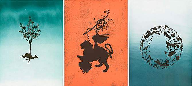
On a recent visit to the Palace of Legion of Honor, I viewed Darren Waterston: A Compendium of Creatures in the small but always lovely Logan Gallery of Illustrated Books. I appreciated this modern take on the traditional bestiary with illustrations and corresponding comments/lessons. The companion publication is beautiful, and I've enjoyed reading it, but the images are a pale shadow of the pages on display at the Legion, with their sumptuous backgrounds and large scale compositions. Up into December, so there's lots of time to check it out. 

Wednesday, January 23, 2013

Calligraphy Out of Character at Asian Art Museum

Out of Character: Decoding Chinese Calligraphy was on view at the Asian Art Museum (SF) Oct 3, 2012 – Jan 13, 2013.  Based on the extensive classical calligraphy collection of Yahoo! co-founder Jerry Yang, this show filled the Asian’s two main exhibition galleries on the first floor, and the lobby between them.

I was up and down about this show. It was amazing to see all these pieces, many of which have never publicly displayed. I thought the curators did a pretty good job of explaining calligraphy techniques and the importance of calligraphy for an audience that may have had no prior exposure to this kind of work. Most classical calligraphy utilizes poetry as its subject matter, and the museum provided helpful translations (there is a good video about this on the AAM’s site). After close scrutiny, I was awed by the way the writing was both fluid and precise, brush and ink on paper or silk which allows few corrections. Included in the show were several acknowledged masterpieces, like one of the seven hand scrolls of The Sutra on the Lotus of the Sublime Dharma by Zhao Mengfu (1254-1322).

The Asian Art Museum's Out of Character: Decoding Chinese Calligraphy gives most of the public a first look at one of the finest private collections. Photo: Stephen Lam, Special To The Chronicle. Read Kenneth Baker's review in the SF Chronicle at http://www.sfgate.com/art/article/Out-of-Character-review-Chinese-calligraphy-4023902.php#ixzz2IqROMZ1k

I was fascinated by the animation The Character of Characters by Xu Bing, which took Mengfu’s piece as his starting point (Video excerpt here). Throughout his career, Xu Bing has explored calligraphy, the written word in general, and how we make meaning out of these symbols. He has presented large installation of books that turned out to be meaningless gibberish (Book from the Sky, 1987-91) and has attempted to organize the icons from all over the world into one universally understood language (Book from the Ground, on-going since 2003). In Character of Characters, he deals with topics ranging from the history and techniques of calligraphy to the modern veneration of logos on luxury goods. My personal favorite was his visualization of how the brain processes writing, which looked like some type of organic Rube Goldberg machine.

A show on a topic of this magnitude can’t cover everything, but there were some things that disappointed me. For one, I didn’t feel enough of the presence of the literati/civil servant. While there was a wall panel explaining the importance of the civil servant’s exams and the idea of the gentleman scholar, this concept is so essential to the meaning, interpretation and purpose of this work that I didn’t think the curators emphasized it enough. A section of the exhibition featuring modern Western art by Mark Tobey, Franz Kline, and Brice Marden, which was meant to stand for Chinese calligraphy's infiltration of modernist aesthetics felt tacked on and didn’t really work. The movement of modern art theory and techniques into Chinese calligraphy itself is such an interesting story, with so many intriguing and impressive works, that I was extremely disappointed none of it was included.

I have written and presented frequently on modern calligraphy in China, and hoped to do an exhibition of the collection of Gordon Barrass, currently archived at the British Museum. See my slideshow embedded below.

Friday, November 9, 2012

Gallery Views of Determining Domain


This past Wednesday night, our long talked about exhibition opened at Intersection for the Arts. Determining Domain is an investigation of intellectual property  issues like infringement, appropriation, derivative works and parody/satire and the tangled web artists have found themselves in since appropriation and/or "borrowing" has become a ubiquitous part of the contemporary artist's palette.  All the artists featured in the show are re-purposing, satirizing or paying homage to the work of another for a wide range of reasons, with great results. I hope that everyone enjoys the photos below, and can make it to the gallery to view the real thing.

Marc H. Greenberg will be doing a lecture about issues in IP at Intersection on 12/8 (Sat) from 1-3. There will also be a workshop on copyright basics (how to register, etc) for artists on 1/16 from 7-9 led by IP attorney Inder Comar.

Determining Domain.
November 7, 2012 – January 19, 2013
Gallery & Community Hours: Tuesdays through Saturdays, 12–6pm, FREE
Intersection's 5M gallery is in the San Francisco Chronicle building at 5th & Mission. See their site for directions, artist's bios (with links to their web sites) and other info. I was happy to see the show listed as a "can't miss" in today's SF Chronicle!

Scott Kildall & Nathaniel Stern, Wikipedia Art & Farnaz Shadravan's Apocalyptic bathtubs.
Detail of one of Farnaz Shadravan's Apocalyptic bathtubs based on Albrecht
Dürer’s late 15th Century woodcut series.
Marc H. Greenberg & Farnaz Shadravan

Two collages by Bigface.

Work from Sanaz Mazinani's Frames of the Visible series.
The exhibit includes several monitors that show artist's work that has been "borrowed" for commercials and other media,  and wall panels explaining what the law is and showing examples from famous cases.
An example panel on parody and satire, written by Kim Munson & Marc H. Greenberg.
Stephanie Syjuco. Raiders, which repurposes digital photos of antiquities of questionable provenance
from a museum web site. 
Scott Tsuchitani's visual commentary on the Geisha &
Samurai shows at the SF Asian Art Museum.
Scott Kildall & Nathaniel Stern, Wikipedia Art. The display includes the dialog between the artists
and Wikipedia, who sued them for infringement.
A wall of posters featuring free digital books about IP issues & piracy,
curated by Stephanie Syjuco.

Wednesday, October 24, 2012

Determining Domain at Intersection

Sanaz Mazinani, Redacted March, 2011 (detail)

Determining Domain, Intersection for the Arts, November 7, 2012 – January 19, 2013. A group exhibition exploring complex issues regarding intellectual property and image ownership.

Years ago, I worked with Intersection on a show about the origins of various symbols (the peace sign, the AFL-CIO handshake, etc...). Since then, we have been discussing, on & off, an exhibition that investigates IP/copyright issues like infringement, appropriation, derivative works & parody/satire. The time has finally arrived, and the show will be opening 11/7!

Features work by Bigface, Scott Kildall & Nathaniel Stern, Sanaz Mazinani, Farnaz Shadravan, Stephanie Syjuco, and Scott Tsuchitani.  Marc Greenberg will be leading a copyright workshop for artists in early December (still TBA). See Intersection's site for calendar and more information.

Sunday, October 21, 2012

Thomas Denmark's Murder of Crows


Cover of "Art of Murder of Crows"
At the Alternative Press Expo (APE) a couple of weekends ago, I had a brief chat with Thomas Denmark, an artist and game designer, who has designed and illustrated (among other things) a card game called Murder of Crows. The object of the game is spell “murder” and when assembled in order, the cards tell a witty short story.  The gothic style of the illustrations and the humorous and slightly twisted characters, weapons & locations are a great update on “Colonel Mustard with the candlestick in the library.”

A totally random selection gave me (M) A rotting stench filled the air (U) on Lynchburg street when (R) Finnegan Faust (D) due to an inferiority complex (E) used chopsticks to impale (R) Tom Thornbritches. People are killed with poodles, nail clippers & frozen turkeys, with all kinds of wacky motivations.

I wasn’t able to find much out about the artist as his web presence seems to be in transition. He has done illustrations for a number of collectible card games: Mentalist Companion, Orkworld RPG,  Legend of the Five Rings, Warlord, Dungeoneer, Dungeons & Dragons, Magic: The Gathering and A Game of Thrones, and has a day job as an artist on several video games. He does have a number of beautiful illustrations on his blog at http://thomasdenmarkportfolio.blogspot.com/

Sunday, September 16, 2012

Bode & Walker, Metalmorphosis at 1:AM

Mark Bode mural on the 6th Street side of 1:AM gallery. Photo by Mark Bode.
Last week I saw Mark Bode & Metalman Ed Walker's show Metalmorphosis at the 1:AM gallery at 1000 Howard Street in SF (August 24-September 22, 2012).  While Bode's previous show at 1:AM was sort of a straight-head father and son retrospective, this show brings Vaughn and Mark's creations to life in a new & vivid 3D style. The show features 60 small-scale to life-size pieces depicting Vaughn Bode's major characters, which Mark and Ed created with sheets of aluminum, acrylic, Montana Colors' Alien spray paint and lettering enamel. It also features 18 three-dimensional metal sculptures by Walker.

One of the most interesting things, to me, was that Mark also drew backgrounds and dialog balloons  behind and around the characters on the gallery walls in pencil, giving the characters more context and narrative. The 1:AM gallery is an intimate space, and it felt to me like I had walked into a 3D comic. Highly recommended!

More info: 1:AM Gallery | SF Gate


If you can't see the slideshow above, click here to see it on Flickr.

Sunday, August 26, 2012

True Blue - Simone Gad & Ingres

I was knocked out by this beautiful painting/collage by the LA artist Simone Gad, who is participating in the True Blue show organized by Charity Burnett at Sangria Fine Arts (LA, opening 8/31/12). True Blue features small pieces by over 60 artists who have become friends, or have invited friends, through social media.

Simone Gad. hommage a ingres painting collage.
copyright simone gad 2012/all rights reserved
First, a little context from Simone about her body of work: "I started out as a fabric artist in 1969, and then moved to making collages on fabric/then collage and assemblage with painting about hollywood icons during the 1970s thru the 1980s. In the 1990s, I started to incorporate art history collage elements into my works -acrylic on canvas with objects, then self-portraits, the holocaust clowns with pinups series from 1998 to 2012, small pinups with building facades also, the art history collages in the 2000s as well as making paintings without collage, continuing my self-portraits series, and now - fudogs paintings, chinatown, and pinups with rescue animals drawings on paper".

As an art historian, I was fascinated with the inclusion of Ingres in this work. Simone explained her concept, beginning with the title: "The painting I have in True Blue is an homage to Ingres and the Princess - hence the title - Hommage a Ingres.I have always loved art history and have incorporated from time to time collage elements in my paintings of building facades re Belgium Art Nouveau - since Brussels is my birthtown; Old Los Angeles structures - ala Victorians, Craftsman homes, some Art Deco, and Chinatown Plaza pagodas, etc... in my funky expressionist style of heavily built up acrylic in layers on canvas. I love Ingres' paintings and bought this postcard of Princesse Albert de Broglie during one of my trips to the Metropolitan Museum in NYC, which I incorporated into one of my buildings of Atwater Village/Los Feliz area of So California. The Princess wearing her lavish blue gown, inspired me to make my building facade in the same shade of blue".

Jean-Auguste-Dominique Ingres (French, Montauban 1780–1867 Paris). Béarn (1825–1860), Princesse de Broglie. 1851–53, Oil on canvas, 47 3/4 x 35 3/4 in., Robert Lehman Collection, 1975, 1975.1.186 Metropolitan Museum of Art.
I have always loved this painting, and took this occasion to refresh my memory of it. The Princess, who was renowned for her elegance and beauty, sat for one of the last commissioned female portraits Ingres undertook. He also painted her sister-in-law, the Comtesse d'Haussonville in 1845 (hanging right down the street at the Frick Collection). Unfortunately, the princess died of consumption at age 35. Her husband kept this portrait in a prominent place, draped with dark curtains in tribute to his lost love. Simone and I discussed this story, and agreed that this kind of loyalty is the very meaning of "True Blue."

Simone has an upcoming solo show (her 4th) at the L2kontemporary gallery (Hill Street, Downtown LA) January 5 - February 9, 2013. This page from her previous show at the Bleicher/GoLightly Gallery features a great photo of her studio. Other works by Simone can be seen on the bluecanvas site.

Karrie Hovey & The Other New York 2012

Karrie Hovey, an SFSU MFA alumni who just finished a residency here in SF at Recology (previous post here), has just installed her work at the Everson Museum of Art (Syracuse and Onondaga, NY September 22, 2012 - January 6, 2013), for their multi-venue biennial The Other New York: 2012. Shown in at 14 participating venues (museums, outdoors, & other public spaces) the project is intended to showcase artists in Upstate & Central New York, and encourage interaction between the artwork and the public.

Karrie's work builds on some of the past projects I've loved, such as Mum, a piece she began while doing her residency at Recology, utilizing the endless supply of discarded books they received.

Karrie Hovey, Utica, NY (b. St. Johnsbury, VT, 1971).
Mum (detail), 2012. Site-specific installation, salvaged books, variable.
About Mum Karrie says: "In many parts of the world the chrysanthemum (a mum) is seen as a flower of mourning and grief, while in other cultures it is a joyous flower of rejuvenation. I have constructed a field of chrysanthemum inspired forms from discarded books. Playing off an alternate definition of “mum” as a command to not speak, the repeated pattern mourns the loss of physical books and laments the silencing of their content. On the other hand, given the current efforts made to digitize all printed volumes, many written works that historically have had limited availability are giving a new life. I see books as a symbol of potential and knowledge, a resource for personal and societal growth. I reference a circular trunk-like form to suggest the forests of trees destroyed in the creation of the books".

Karrie Hovey. ...the Garden Grows : Cultivate Garden 1
In addition, she installed ...the Garden Grows : Cultivate Garden 1, a work that reuses cast-off materials from retail stores (such as wrapping paper and shopping bags) to construct a fantasy garden.  Encypher is a map project based on the museum's floor plan, area freeways, and other local topography, with materials supplied by Golden Artist Colors and The Sam and Adele Golden Foundation. She explains her process in the video below:


if this video isn't working right, click here to see it on YouTube.

Karrie Hovey. Encypher.
See more of Karrie's work on her web site.